Working with JavaFX 2 Layout Managers
My original objective was to work with the GridPane layout manager. During my learning process I ended up working with the VBox, HBox, BorderPane and GridPane.
Below is the code. Please see attached PDFs. I have two versions of each PDF with our without line numbers. Also consider taking a look at several tutorials on other layout managers in JavaFX 2 on javadesk.co website.
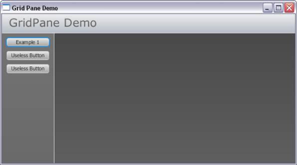
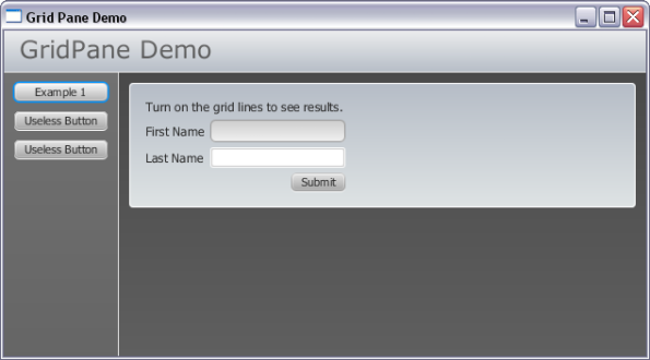
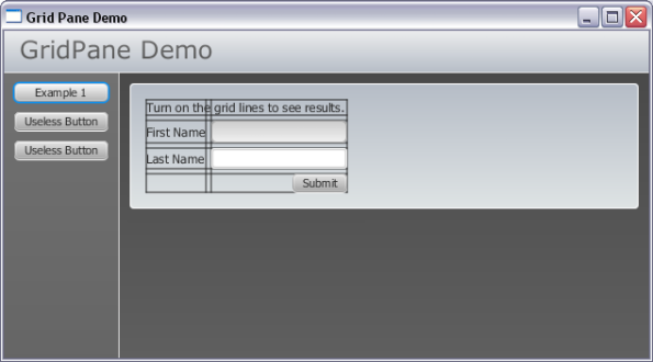
Screen shots
PDFs of JavaFX 2 Code
 JavaFX 2 application (no line numbers)This version of the source code does not contain line numbers. Use this version for copy / paste.
 JavaFX 2 CSS style sheet (no line numbers)This version of the CSS style sheet used with application does not contain line numbers. Use this version for copy / paste.
 JavaFX 2 application (with line numbers)This version of the source code contains line numbers. Use this version for printing.
 JavaFX 2 CSS style sheet (with line numbers)This version of the CSS style sheet used with application contains line numbers. Use this version for printing.
Demo1.java
package ui.layouts.GridPane;

import javafx.application.Application;
import javafx.event.ActionEvent;
import javafx.event.EventHandler;
import javafx.geometry.HPos;
import javafx.geometry.Pos;
import javafx.geometry.Rectangle2D;
import javafx.scene.Scene;
import javafx.scene.control.Button;
import javafx.scene.control.Label;
import javafx.scene.control.TextField;
import javafx.scene.layout.BorderPane;
import javafx.scene.layout.GridPane;
import javafx.scene.layout.HBox;
import javafx.scene.layout.VBox;
import javafx.stage.Screen;
import javafx.stage.Stage;

/**
 * Demo1. Entry point into demonstration application.
 */
public class Demo1 extends Application {

    private BorderPane layout;
    private Scene scene;
    private TextField txtFirstName, txtLastName;

    @Override
    public void start(Stage stage) {

        //Create BorderPane layout manager.
        layout = new BorderPane();  //This is the "root node".

        //Give Root Node a CSS ID Attribute
        layout.setId("appContainer");

        //Set Scene Properties.
        setSceneProperties();

        //Build Demo App Layout
        buildLeft();
        buildTop();

        //Set a few properties of our Application Window
        stage.setScene(scene);
        stage.setTitle("Grid Pane Demo");
        stage.show();
    }

    /**
     * main. Application Entry Point.
     * @param args
     */
    public static void main(String[] args) {
        launch();
    }

    /**
     * buildLeft. This method builds the Left Region of BorderPane.
     * This is a BorderPane with VBox containing buttons and border.
     */
    private void buildLeft() {

        BorderPane leftLayout = new BorderPane();

        // Create a faux border-right effect using a Label.
        Label divider = new Label();
        divider.setId("divider1");
        divider.setPrefWidth(1);
        divider.setMinHeight(Screen.getPrimary().getBounds().getHeight());
        leftLayout.setRight(divider);

        //Place all demonstration buttons in a Vercial Box.
        VBox buttonBox = new VBox();

        //Set Alignment of Buttons in VBox Container.
        buttonBox.setAlignment(Pos.TOP_CENTER);

        //Give VBox a CSS ID
        buttonBox.setId("buttonMenuContainer");

        //Create some vertical spacing b/n buttons
        buttonBox.setSpacing(10);

        //Add Demonstration Buttons
        Button btnExample1 = new Button();

        //Set Button Text
        btnExample1.setText("Example 1");

        //Set All Buttons to the same size.
        btnExample1.setMaxWidth(Double.MAX_VALUE);

        //Add Click Event.
        btnExample1.setOnAction(new EventHandler() {

            @Override
            public void handle(ActionEvent event) {
                System.out.println("Example 1 Button Clicked.");
                layout.setCenter(example1());
            }
        });

        //Create Button 2
        Button btnExample2 = new Button();
        btnExample2.setText("Useless Button");
        btnExample2.setMaxWidth(Double.MAX_VALUE);
        btnExample2.setOnAction(new EventHandler() {

            @Override
            public void handle(ActionEvent event) {
                System.out.println("Example 2 Button Clicked.");
            }
        });

        //Create Button 3
        Button btnExample3 = new Button();
        btnExample3.setText("Useless Button");
        btnExample3.setMaxWidth(Double.MAX_VALUE);
        btnExample3.setOnAction(new EventHandler() {

            @Override
            public void handle(ActionEvent event) {
                System.out.println("Example 3 Button Clicked.");
            }
        });

        buttonBox.getChildren().addAll(btnExample1, btnExample2, btnExample3);

        //Add VBox to leftLayout.
        leftLayout.setCenter(buttonBox);

        //Place into Application.
        layout.setLeft(leftLayout);

    }

    /**
     * buildTop. Create a Title Bar.
     */
    private void buildTop() {

        BorderPane topLayout = new BorderPane();

        //Add CSS Style ID.
        topLayout.setId("topLayoutContainer");

        // Create a faux border-bottom effect using a Label.
        Label divider = new Label();
        divider.setId("divider2");
        divider.setMaxHeight(1);
        divider.setMinHeight(1);
        divider.setMinWidth(Screen.getPrimary().getBounds().getWidth());
        topLayout.setBottom(divider);

        //Create an HBox to hold title.
        //We use the HBox to set text alignment to TOP LEFT
        HBox titleBox = new HBox();
        titleBox.setAlignment(Pos.TOP_LEFT);
        titleBox.setId("titleBox");

        //Create title.
        Label title = new Label();
        title.setText("GridPane Demo");
        title.setId("appTitle");

        //Add Title label to titleBox
        titleBox.getChildren().add(title);

        //Add Title Box (with label) to topLayout
        topLayout.setCenter(titleBox);

        //Add topLayout (a BorderPane Manager) to App Layout.
        layout.setTop(topLayout);

    }

    /**
     * setSceneProperties. This simply sets app to almost full size.
     * It also is where the css stylesheet is attached to app.
     */

    private void setSceneProperties()
    {
        //The percentage values are used as multipliers for screen width/height.
        double percentageWidth = 0.98;
        double percentageHeight = 0.90;

        //Calculate the width / height of screen.
        Rectangle2D screenSize = Screen.getPrimary().getBounds();
        percentageWidth *= screenSize.getWidth();
        percentageHeight *= screenSize.getHeight();

        //Create a scene object. Pass in the layout and set
        //the dimensions to 98% of screen width & 90% screen height.
        this.scene = new Scene(layout, percentageWidth, percentageHeight);

        //Add CSS Style Sheet (located in same package as this class).
        String css = this.getClass().getResource("Demo1.css").toExternalForm();
        scene.getStylesheets().add(css);

    }

    /**
     * example1. This method just creates a simple GridPane with 2
     * rows and 2 columns. This example demonstrates the use of
     * showing gridLines.
     * @return
     */
    private VBox example1() {

        //Create a container to fill 100% space in Center Region of
        //App BorderPane (layout).
        VBox exContainer = new VBox();
        exContainer.setId("exContainer");

        //Create a new GridPane.
        GridPane gridPane = new GridPane();

        //Turn on GridLines so we can see what is going on.
        gridPane.setGridLinesVisible(true);

        //Give the GridPane an ID for CSS Styles.
        gridPane.setId("gridPane_Example1");

        //Add some spacing between each control.
        //Comment the next 2 lines out to see what happens when this is
        //not explicitly set. It will remove the padding you specified.
        gridPane.setHgap(5);
        gridPane.setVgap(5);

        //Add a description of what we are doing to GridPane.
        //This description starts in Row 0, Col 0 and spans
        //2 columns and one row.
        Label label = new Label("Turn on the grid lines to see results.");
        gridPane.add(label, 0,0,2,1);

        //Add A Label. The label starts in Col 0, Row 1 and does not
        //span any columns or rows.
        gridPane.add(new Label("First Name"), 0, 1);

        //Add a TextField. The textfield starts in Col 1, Row 1 and
        //does not span any columns or rows.
        txtFirstName = new TextField();
        txtFirstName.setId("txtFirstName");
        gridPane.add(txtFirstName, 1,1);

        //Add Last Name label in Col 0, Row 2
        gridPane.add(new Label("Last Name"), 0,2);

        //Add Last Name Text Field in Col 1, Row 2.
        txtLastName = new TextField();
        txtLastName.setId("txtLastName");
        gridPane.add(txtLastName, 1,2);

        //Add a Submit Button.
        Button submitButton = new Button("Submit");
        submitButton.setOnAction(new EventHandler() {

            @Override
            public void handle(ActionEvent event) {
                System.out.printf("Submit Button Clicked. Hi there %s %s",
                        txtFirstName.getText(), txtLastName.getText());
            }
        });
        gridPane.add(submitButton, 1,3);

        //Align the Submit Button to Right.
        gridPane.setHalignment(submitButton, HPos.RIGHT);

        //Add GridPane to container.
        exContainer.getChildren().add(gridPane);

        //Return Container
        return exContainer;
    }
}
Demo1.css
/*
    Document   : Demo1
    Created on : Mar 22, 2012, 11:20:14 AM
    Description: Style our JavaFX 2 application demo.
                 Put this css style sheet in same package
                 (or directory) as Java class.
*/

/**
 * This is the root node. In demo this is the BorderPane that is passed
 * into the Scene constructor.
 */
#appContainer {
    -fx-background-color: linear-gradient(to bottom, #464646, #5f5f5f);
}

/**
 * This CSS style is for the buttonBox in Left region of BorderPane.
 * It sets a linear gradient background color and applies a 1px padding
 * around the VBox inner edges.
 */
#buttonMenuContainer {
    -fx-background-color: linear-gradient(to bottom, #737373, #595959);
    -fx-padding: 10px;
}

/**
 * Give the buttonBox container a subtle hover effect.
 */
#buttonMenuContainer:hover {
    -fx-background-color: linear-gradient(to bottom, #717171, #515151);
}

/**
 * This is a makeshift border. #divider1 creates the right border inside
 * The Application's Left Region. #divider2 creates the bottom border
 * for the title.
 *
 * The idea was to use a Blank Label. For example, for the Title, which is
 * located in the BorderPane Top Region; I've set the Labels minWidth
 * property to the screen size. This creates the effect of a bottom border.
 *
 * Set the background color here.
 */
#divider1, #divider2{
    -fx-background-color: linear-gradient(to bottom, #dad9d9, #ffffff);
}

/**
 * the topLayoutContainer is a BorderPane manager that is placed inside the
 * application's layout container (root node). This is how I was able to
 * create the bottom border effect (#divider2).
 */
#topLayoutContainer {
    -fx-background-color: linear-gradient(to bottom, #ebeced, #b5bcc6);
}

/**
 * appTitle text.
 */
#appTitle {
    -fx-text-fill: linear-gradient(to bottom, #717171, #515151);
    -fx-font-family: verdana;
    -fx-font-size: 24px;
}

/**
 * This class is a HBox used to set the alignment of the appTitle Text
 * The padding is set to push the title down and to the right from the
 * container edges.
 */
#titleBox {
    -fx-padding: 10px 0 0 15px;
}

/*
 * In this css style, we are applying styles to a GridPane.
 * We apply a border with radius. We also need to apply the
 * background radius. This creates the rounded corners when
 * the first button is clicked. Remember to set both background
 * and border radius.
 */
#gridPane_Example1 {
    -fx-border-color: #ffffff;
    -fx-border-width: 1px;
    -fx-border-radius: 4;
    -fx-background-radius: 4;
    -fx-background-color: linear-gradient(to bottom, #b5bcc6, #dee3e4);
    -fx-padding: 15;

}

/**
 * exContainer ID is applied to a VBox. This VBox is what is physically
 * loaded into the Applications Center region (root node). I use the VBox
 * so content automatically fills available space. 100% width and height.
 */
#exContainer {
    -fx-padding: 10px;
}

/**
 * First Name TextField.
 */
#txtFirstName {
    -fx-border-color: #939393;
    -fx-border-radius: 5px;
    -fx-background-radius: 5px;
    -fx-background-color: linear-gradient(to bottom, #cccccc, #f2f2f2);
}

/**
 * The focused effect.
 */
#txtFirstName:focused {
    -fx-border-color: linear-gradient(to left, #ff0000, #7d1e15);
}

/**
 * The hover effect.
 */
#txtFirstName:hover {
    -fx-border-color: linear-gradient(to left, #ffca45, #f8a70f);
}

/**
 * Keep the focused coloring when mouse is still hovering over
 * text field while active.
 */
#txtFirstName:focused:hover {
    -fx-border-color: linear-gradient(to left, #ff0000, #7d1e15);
}

/**
 * Apply this style to all Label objects.
 */
Label {
    -fx-font-size: 12px;
    -fx-font-weight: lighter;
}


Very intersting example.
I’m wondering if you could share the project files (netbeans).
That will be really appreciated.
Thank you.
Hi Darius, Thanks for taking time to comment. Sorry for delay – a zip file is available. http://www.greggsetzer.com/GridPaneDemo.zip
Beautiful!!!
Thank you very much