Archive
Java FX 2 Linear Gradients
I really didnt understand the concept of multiple linear gradients so I decided to study Jasper’s demo on styling fx buttons with CSS. I picked the example “Large iPad Dark Grey” for this demonstration.
As you can see, multiple gradients make up the glossy button effect. I am visual person so to me this example is stunning.
I was pleasantly surprised at the simplicity after reviewing the CSS styles that create these buttons. I suspect its one thing to say it looks easy but I am sure it requires creativity to blend the colors.
The concept behind building this button is working with multiple linear gradients. The trick is creating multiple layers, each with their own gradient effect and adjusting the background radius and background insets.
#ipad-dark-grey {
    -fx-background-color:
        linear-gradient(#686868 0%, #232723 25%, #373837 75%, #757575 100%),
        linear-gradient(#020b02, #3a3a3a),
        linear-gradient(#9d9e9d 0%, #6b6a6b 20%, #343534 80%, #242424 100%),
        linear-gradient(#8a8a8a 0%, #6b6a6b 20%, #343534 80%, #262626 100%),
        linear-gradient(#777777 0%, #606060 50%, #505250 51%, #2a2b2a 100%);
    -fx-background-insets: 0,1,4,5,6;
    -fx-background-radius: 9,8,5,4,3;
    -fx-padding: 15 30 15 30;
    -fx-font-family: "Helvetica";
    -fx-font-size: 18px;
    -fx-font-weight: bold;
    -fx-text-fill: white;
    -fx-effect: dropshadow( three-pass-box , rgba(255,255,255,0.2) ,
                1, 0.0 , 0 , 1);
}
Take notice that there is a background inset and background radius that is paired with each linear gradient. In this example there are 5 linear gradients, 5 background-radius settings, and background-insets settings.
The [unattractive] example below color coordinates the matching linear-gradient and background properties together. I hope it helps to visualize the relationship between the linear-gradient and its inset and radius.
In theory, Jasper has layered multiple background fills on top of each other. With each overlay he has reduced the radius and increased the background inset.
-fx-background-color:
    linear-gradient(#686868 0%, #232723 25%, #373837 75%, #757575 100%),
    linear-gradient(#020b02, #3a3a3a),
    linear-gradient(#9d9e9d 0%, #6b6a6b 20%, #343534 80%, #242424 100%),
    linear-gradient(#8a8a8a 0%, #6b6a6b 20%, #343534 80%, #262626 100%),
    linear-gradient(#777777 0%, #606060 50%, #505250 51%, #2a2b2a 100%);
-fx-background-insets: 0,1,4,5,6;
-fx-background-radius: 9,8,5,4,3;
How a linear gradient works
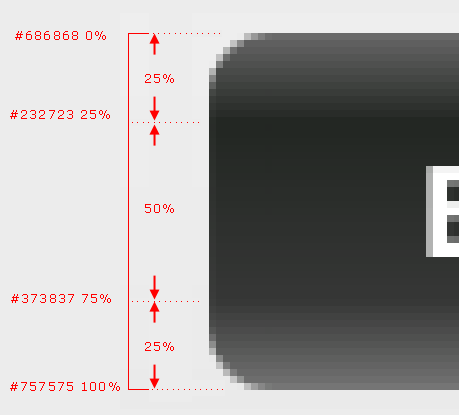
Using the example above in orange, here is how a linear gradient works. Starting from the top to the bottom, the first color is #686686 and transitions into color #232723. This consumes the first 25% of the button’s vertical space.
The next color #373837 will consume the next 50% of the button’s vertical space. And finally the color range stops at #757575.
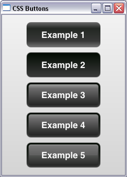
Here is a demo program to show the layering effect one gradient at a time. I go into more detail with CSS button styles for JavaFX 2 apps on my website. Please have a look.
ButtonDemo.java
package ui.layouts.buttons;

import javafx.application.Application;
import javafx.geometry.Pos;
import javafx.scene.Scene;
import javafx.scene.control.Button;
import javafx.scene.layout.VBox;
import javafx.stage.Stage;

public class ButtonDemo extends Application {

    private VBox layout; // This is the root node.

    /**
     * start. Build and show the JavaFX application.
     * @param stage
     */
    @Override
    public void start(Stage stage) {

        layout = new VBox();

        //Set CSS ID
        layout.setId("app");

        //Center in VBox.
        layout.setAlignment(Pos.CENTER);

        //Set Spacing b/n each button.
        layout.setSpacing(10);

        Button b1 = new Button("Example 1");
        b1.setId("b1");

        Button b2 = new Button("Example 2");
        b2.setId("b2");

        Button b3 = new Button("Example 3");
        b3.setId("b3");

        Button b4 = new Button("Example 4");
        b4.setId("b4");

        Button b5 = new Button("Example 5");
        b5.setId("b5");

        layout.getChildren().addAll(b1, b2, b3, b4, b5);

        //Create Scene, add css stylesheet.
        Scene scene = new Scene(layout, 250, 325);
        String cssURL = "ButtonsDemo.css";
        String css = this.getClass().getResource(cssURL).toExternalForm();
        scene.getStylesheets().add(css);

        //Set stage properties.
        stage.setScene(scene);
        stage.setTitle("CSS Buttons");
        stage.show();
    }

    /**
     * Application Entry Point.
     * @param args
     */
    public static void main(String[] args) {
        launch();
    }
}
ButtonsDemo.css
#app {
    -fx-background-color:
    linear-gradient(to bottom, #f2f2f2, #d4d4d4);
}

#b1 {
    -fx-text-fill:white;
    -fx-padding: 15 30 15 30;
    -fx-font-family: "Helvetica";
    -fx-font-size: 18px;
    -fx-font-weight: bold;

    -fx-background-color:
    linear-gradient(#686868 0%, #232723 25%, #373837 75%, #757575 100%);
    -fx-background-insets: 0;
    -fx-background-radius: 9;
}

#b2 {
    -fx-text-fill:white;
    -fx-padding: 15 30 15 30;
    -fx-font-family: "Helvetica";
    -fx-font-size: 18px;
    -fx-font-weight: bold;

    -fx-background-color:
    linear-gradient(#686868 0%, #232723 25%, #373837 75%, #757575 100%),
    linear-gradient(#020b02, #3a3a3a);
    -fx-background-insets: 0,1;
    -fx-background-radius: 9,8;
}

#b3 {
    -fx-text-fill:white;
    -fx-padding: 15 30 15 30;
    -fx-font-family: "Helvetica";
    -fx-font-size: 18px;
    -fx-font-weight: bold;

    -fx-background-color:
    linear-gradient(#686868 0%, #232723 25%, #373837 75%, #757575 100%),
    linear-gradient(#020b02, #3a3a3a),
    linear-gradient(#9d9e9d 0%, #6b6a6b 20%, #343534 80%, #242424 100%);
    -fx-background-insets: 0,1,4;
    -fx-background-radius: 9,8,5;
}

#b4 {
    -fx-text-fill:white;
    -fx-padding: 15 30 15 30;
    -fx-font-family: "Helvetica";
    -fx-font-size: 18px;
    -fx-font-weight: bold;

    -fx-background-color:
    linear-gradient(#686868 0%, #232723 25%, #373837 75%, #757575 100%),
    linear-gradient(#020b02, #3a3a3a),
    linear-gradient(#9d9e9d 0%, #6b6a6b 20%, #343534 80%, #242424 100%),
    linear-gradient(#8a8a8a 0%, #6b6a6b 20%, #343534 80%, #262626 100%);
    -fx-background-insets: 0,1,4,5;
    -fx-background-radius: 9,8,5,4;
}

#b5 {
    -fx-text-fill:white;
    -fx-padding: 15 30 15 30;
    -fx-font-family: "Helvetica";
    -fx-font-size: 18px;
    -fx-font-weight: bold;

    -fx-background-color:
    linear-gradient(#686868 0%, #232723 25%, #373837 75%, #757575 100%),
    linear-gradient(#020b02, #3a3a3a),
    linear-gradient(#9d9e9d 0%, #6b6a6b 20%, #343534 80%, #242424 100%),
    linear-gradient(#8a8a8a 0%, #6b6a6b 20%, #343534 80%, #262626 100%),
    linear-gradient(#777777 0%, #606060 50%, #505250 51%, #2a2b2a 100%);
    -fx-background-insets: 0,1,4,5,6;
    -fx-background-radius: 9,8,5,4,3;
}
Working with JavaFX 2 Layout Managers
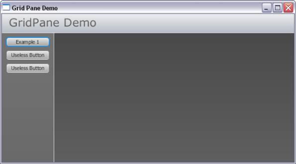
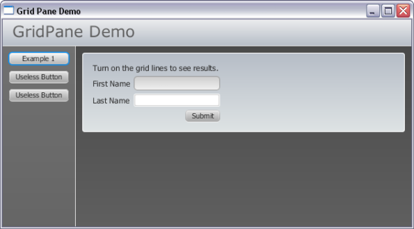
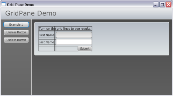
My original objective was to work with the GridPane layout manager. During my learning process I ended up working with the VBox, HBox, BorderPane and GridPane.
Below is the code. Please see attached PDFs. I have two versions of each PDF with our without line numbers. Also consider taking a look at several tutorials on other layout managers in JavaFX 2 on javadesk.co website.
Screen shots
PDFs of JavaFX 2 Code
 JavaFX 2 application (no line numbers)This version of the source code does not contain line numbers. Use this version for copy / paste.
 JavaFX 2 CSS style sheet (no line numbers)This version of the CSS style sheet used with application does not contain line numbers. Use this version for copy / paste.
 JavaFX 2 application (with line numbers)This version of the source code contains line numbers. Use this version for printing.
 JavaFX 2 CSS style sheet (with line numbers)This version of the CSS style sheet used with application contains line numbers. Use this version for printing.
Demo1.java
package ui.layouts.GridPane;

import javafx.application.Application;
import javafx.event.ActionEvent;
import javafx.event.EventHandler;
import javafx.geometry.HPos;
import javafx.geometry.Pos;
import javafx.geometry.Rectangle2D;
import javafx.scene.Scene;
import javafx.scene.control.Button;
import javafx.scene.control.Label;
import javafx.scene.control.TextField;
import javafx.scene.layout.BorderPane;
import javafx.scene.layout.GridPane;
import javafx.scene.layout.HBox;
import javafx.scene.layout.VBox;
import javafx.stage.Screen;
import javafx.stage.Stage;

/**
 * Demo1. Entry point into demonstration application.
 */
public class Demo1 extends Application {

    private BorderPane layout;
    private Scene scene;
    private TextField txtFirstName, txtLastName;

    @Override
    public void start(Stage stage) {

        //Create BorderPane layout manager.
        layout = new BorderPane();  //This is the "root node".

        //Give Root Node a CSS ID Attribute
        layout.setId("appContainer");

        //Set Scene Properties.
        setSceneProperties();

        //Build Demo App Layout
        buildLeft();
        buildTop();

        //Set a few properties of our Application Window
        stage.setScene(scene);
        stage.setTitle("Grid Pane Demo");
        stage.show();
    }

    /**
     * main. Application Entry Point.
     * @param args
     */
    public static void main(String[] args) {
        launch();
    }

    /**
     * buildLeft. This method builds the Left Region of BorderPane.
     * This is a BorderPane with VBox containing buttons and border.
     */
    private void buildLeft() {

        BorderPane leftLayout = new BorderPane();

        // Create a faux border-right effect using a Label.
        Label divider = new Label();
        divider.setId("divider1");
        divider.setPrefWidth(1);
        divider.setMinHeight(Screen.getPrimary().getBounds().getHeight());
        leftLayout.setRight(divider);

        //Place all demonstration buttons in a Vercial Box.
        VBox buttonBox = new VBox();

        //Set Alignment of Buttons in VBox Container.
        buttonBox.setAlignment(Pos.TOP_CENTER);

        //Give VBox a CSS ID
        buttonBox.setId("buttonMenuContainer");

        //Create some vertical spacing b/n buttons
        buttonBox.setSpacing(10);

        //Add Demonstration Buttons
        Button btnExample1 = new Button();

        //Set Button Text
        btnExample1.setText("Example 1");

        //Set All Buttons to the same size.
        btnExample1.setMaxWidth(Double.MAX_VALUE);

        //Add Click Event.
        btnExample1.setOnAction(new EventHandler() {

            @Override
            public void handle(ActionEvent event) {
                System.out.println("Example 1 Button Clicked.");
                layout.setCenter(example1());
            }
        });

        //Create Button 2
        Button btnExample2 = new Button();
        btnExample2.setText("Useless Button");
        btnExample2.setMaxWidth(Double.MAX_VALUE);
        btnExample2.setOnAction(new EventHandler() {

            @Override
            public void handle(ActionEvent event) {
                System.out.println("Example 2 Button Clicked.");
            }
        });

        //Create Button 3
        Button btnExample3 = new Button();
        btnExample3.setText("Useless Button");
        btnExample3.setMaxWidth(Double.MAX_VALUE);
        btnExample3.setOnAction(new EventHandler() {

            @Override
            public void handle(ActionEvent event) {
                System.out.println("Example 3 Button Clicked.");
            }
        });

        buttonBox.getChildren().addAll(btnExample1, btnExample2, btnExample3);

        //Add VBox to leftLayout.
        leftLayout.setCenter(buttonBox);

        //Place into Application.
        layout.setLeft(leftLayout);

    }

    /**
     * buildTop. Create a Title Bar.
     */
    private void buildTop() {

        BorderPane topLayout = new BorderPane();

        //Add CSS Style ID.
        topLayout.setId("topLayoutContainer");

        // Create a faux border-bottom effect using a Label.
        Label divider = new Label();
        divider.setId("divider2");
        divider.setMaxHeight(1);
        divider.setMinHeight(1);
        divider.setMinWidth(Screen.getPrimary().getBounds().getWidth());
        topLayout.setBottom(divider);

        //Create an HBox to hold title.
        //We use the HBox to set text alignment to TOP LEFT
        HBox titleBox = new HBox();
        titleBox.setAlignment(Pos.TOP_LEFT);
        titleBox.setId("titleBox");

        //Create title.
        Label title = new Label();
        title.setText("GridPane Demo");
        title.setId("appTitle");

        //Add Title label to titleBox
        titleBox.getChildren().add(title);

        //Add Title Box (with label) to topLayout
        topLayout.setCenter(titleBox);

        //Add topLayout (a BorderPane Manager) to App Layout.
        layout.setTop(topLayout);

    }

    /**
     * setSceneProperties. This simply sets app to almost full size.
     * It also is where the css stylesheet is attached to app.
     */

    private void setSceneProperties()
    {
        //The percentage values are used as multipliers for screen width/height.
        double percentageWidth = 0.98;
        double percentageHeight = 0.90;

        //Calculate the width / height of screen.
        Rectangle2D screenSize = Screen.getPrimary().getBounds();
        percentageWidth *= screenSize.getWidth();
        percentageHeight *= screenSize.getHeight();

        //Create a scene object. Pass in the layout and set
        //the dimensions to 98% of screen width & 90% screen height.
        this.scene = new Scene(layout, percentageWidth, percentageHeight);

        //Add CSS Style Sheet (located in same package as this class).
        String css = this.getClass().getResource("Demo1.css").toExternalForm();
        scene.getStylesheets().add(css);

    }

    /**
     * example1. This method just creates a simple GridPane with 2
     * rows and 2 columns. This example demonstrates the use of
     * showing gridLines.
     * @return
     */
    private VBox example1() {

        //Create a container to fill 100% space in Center Region of
        //App BorderPane (layout).
        VBox exContainer = new VBox();
        exContainer.setId("exContainer");

        //Create a new GridPane.
        GridPane gridPane = new GridPane();

        //Turn on GridLines so we can see what is going on.
        gridPane.setGridLinesVisible(true);

        //Give the GridPane an ID for CSS Styles.
        gridPane.setId("gridPane_Example1");

        //Add some spacing between each control.
        //Comment the next 2 lines out to see what happens when this is
        //not explicitly set. It will remove the padding you specified.
        gridPane.setHgap(5);
        gridPane.setVgap(5);

        //Add a description of what we are doing to GridPane.
        //This description starts in Row 0, Col 0 and spans
        //2 columns and one row.
        Label label = new Label("Turn on the grid lines to see results.");
        gridPane.add(label, 0,0,2,1);

        //Add A Label. The label starts in Col 0, Row 1 and does not
        //span any columns or rows.
        gridPane.add(new Label("First Name"), 0, 1);

        //Add a TextField. The textfield starts in Col 1, Row 1 and
        //does not span any columns or rows.
        txtFirstName = new TextField();
        txtFirstName.setId("txtFirstName");
        gridPane.add(txtFirstName, 1,1);

        //Add Last Name label in Col 0, Row 2
        gridPane.add(new Label("Last Name"), 0,2);

        //Add Last Name Text Field in Col 1, Row 2.
        txtLastName = new TextField();
        txtLastName.setId("txtLastName");
        gridPane.add(txtLastName, 1,2);

        //Add a Submit Button.
        Button submitButton = new Button("Submit");
        submitButton.setOnAction(new EventHandler() {

            @Override
            public void handle(ActionEvent event) {
                System.out.printf("Submit Button Clicked. Hi there %s %s",
                        txtFirstName.getText(), txtLastName.getText());
            }
        });
        gridPane.add(submitButton, 1,3);

        //Align the Submit Button to Right.
        gridPane.setHalignment(submitButton, HPos.RIGHT);

        //Add GridPane to container.
        exContainer.getChildren().add(gridPane);

        //Return Container
        return exContainer;
    }
}
Demo1.css
/*
    Document   : Demo1
    Created on : Mar 22, 2012, 11:20:14 AM
    Description: Style our JavaFX 2 application demo.
                 Put this css style sheet in same package
                 (or directory) as Java class.
*/

/**
 * This is the root node. In demo this is the BorderPane that is passed
 * into the Scene constructor.
 */
#appContainer {
    -fx-background-color: linear-gradient(to bottom, #464646, #5f5f5f);
}

/**
 * This CSS style is for the buttonBox in Left region of BorderPane.
 * It sets a linear gradient background color and applies a 1px padding
 * around the VBox inner edges.
 */
#buttonMenuContainer {
    -fx-background-color: linear-gradient(to bottom, #737373, #595959);
    -fx-padding: 10px;
}

/**
 * Give the buttonBox container a subtle hover effect.
 */
#buttonMenuContainer:hover {
    -fx-background-color: linear-gradient(to bottom, #717171, #515151);
}

/**
 * This is a makeshift border. #divider1 creates the right border inside
 * The Application's Left Region. #divider2 creates the bottom border
 * for the title.
 *
 * The idea was to use a Blank Label. For example, for the Title, which is
 * located in the BorderPane Top Region; I've set the Labels minWidth
 * property to the screen size. This creates the effect of a bottom border.
 *
 * Set the background color here.
 */
#divider1, #divider2{
    -fx-background-color: linear-gradient(to bottom, #dad9d9, #ffffff);
}

/**
 * the topLayoutContainer is a BorderPane manager that is placed inside the
 * application's layout container (root node). This is how I was able to
 * create the bottom border effect (#divider2).
 */
#topLayoutContainer {
    -fx-background-color: linear-gradient(to bottom, #ebeced, #b5bcc6);
}

/**
 * appTitle text.
 */
#appTitle {
    -fx-text-fill: linear-gradient(to bottom, #717171, #515151);
    -fx-font-family: verdana;
    -fx-font-size: 24px;
}

/**
 * This class is a HBox used to set the alignment of the appTitle Text
 * The padding is set to push the title down and to the right from the
 * container edges.
 */
#titleBox {
    -fx-padding: 10px 0 0 15px;
}

/*
 * In this css style, we are applying styles to a GridPane.
 * We apply a border with radius. We also need to apply the
 * background radius. This creates the rounded corners when
 * the first button is clicked. Remember to set both background
 * and border radius.
 */
#gridPane_Example1 {
    -fx-border-color: #ffffff;
    -fx-border-width: 1px;
    -fx-border-radius: 4;
    -fx-background-radius: 4;
    -fx-background-color: linear-gradient(to bottom, #b5bcc6, #dee3e4);
    -fx-padding: 15;

}

/**
 * exContainer ID is applied to a VBox. This VBox is what is physically
 * loaded into the Applications Center region (root node). I use the VBox
 * so content automatically fills available space. 100% width and height.
 */
#exContainer {
    -fx-padding: 10px;
}

/**
 * First Name TextField.
 */
#txtFirstName {
    -fx-border-color: #939393;
    -fx-border-radius: 5px;
    -fx-background-radius: 5px;
    -fx-background-color: linear-gradient(to bottom, #cccccc, #f2f2f2);
}

/**
 * The focused effect.
 */
#txtFirstName:focused {
    -fx-border-color: linear-gradient(to left, #ff0000, #7d1e15);
}

/**
 * The hover effect.
 */
#txtFirstName:hover {
    -fx-border-color: linear-gradient(to left, #ffca45, #f8a70f);
}

/**
 * Keep the focused coloring when mouse is still hovering over
 * text field while active.
 */
#txtFirstName:focused:hover {
    -fx-border-color: linear-gradient(to left, #ff0000, #7d1e15);
}

/**
 * Apply this style to all Label objects.
 */
Label {
    -fx-font-size: 12px;
    -fx-font-weight: lighter;
}
Linking a CSS Style Sheet to JavaFx Scene Graph
The recommended way to link your CSS styles to a Scene Graph in your application is through the stylesheets variable.
Set your css paths relative to your application’s concrete class. This is the class that will extend Application. In the sample project pictured below, the Concrete Application Class is my Driver.java file.
For more information on working with CSS Style Sheets in JavaFX 2 applications please see my article on JavaDesk website. I provide an example where a user can swap Style Sheets dynamically using a ChangeListener.
Driver.java has the class declaration:
launch(args);
}@Override
public void start(Stage primaryStage) {}
}
Example 1: Connect to CSS Style Sheet in same Package
scene.getStylesheets().add(this.getClass()
.getResource(“Styles.css”).toExternalForm());
String cssURL = this.getClass().getResource(“Styles.css”)
.toExternalForm();
scene.getStylesheets().add(cssURL);
scene.getStylesheets().add(ui.Driver.class.getResource(“Styles.css”)
.toExternalForm());
Example 2: Connect to CSS Style Sheet in another Package
scene.getStylesheets().add(this.getClass().
getResource(“/cssStyles/base.css”).toExternalForm());
Example 3: Get Multiple CSS Style Sheets
String cssFile1 = this.getClass().getResource(“x.css”)
.toExternalForm();String cssFile2 = this.getClass().getResource(“Styles.css”)
.toExternalForm();String cssFile3 = this.getClass().getResource(“/cssStyles/base.css”)
.toExternalForm();scene.getStylesheets().addAll(cssFile1, cssFile2, cssFile3);
Apache Web Server on Joyent
Apache Web Server comes installed by default on the SmartOSPlus installation. When I provisioned my machine I had a difficult time finding the Apache directory. To my surprise, it took some time exploring the file system to find the necessary files. Joyent takes a different approach for installing Apache Web Server. Log files are placed with other log files, configuration files are with other configuration files, etc.
It seems most of the the tutorials on the Internet revolve around installing Apache Web Server for personal use. These tutorials expect you to keep the directory structure intact which is clearly different from a Joyent installation.
The important directories are below. This applies to the SmartOSPlus (32 bit) image that Joyent offers. Other OS images may have a different directory structure.
Apache Server Configuration Files:
/opt/local/etc/httpd/
For example, the httpd.conf configuration file is located at:
/opt/local/etc/httpd/httpd.conf
Virtual Host Configuration Files:
/opt/local/etc/httpd/virtualhosts/
For example, the Apache Virtual Host Directive for each of your websites is stored here. If I am hosting http://www.apache.org it would be located at:
/opt/local/etc/httpd/virtualhosts/apache.org.conf
Apache Modules Directory:
/opt/local/lib/httpd/
This is where you will install the mod_jk.so connector for using Tomcat in Apache Web Server.
/opt/local/lib/httpd/mod_jk.so
You will also find mod_alias.so and mod_rewrite.so for URL Rewrites.
Apache Log Files
/var/log/httpd/
You will find access log, error log, module logs, etc. This is a good place to put your mod_jk connector log file and mod_rewrite log files (use mod_rewrite logging for development purposes only).
Setup SSH to connect to Joyent Server
The first step after provisioning your Joyent Server is to connect to it. Please read up on the wiki articles provided at Joyent for setting up a SSH connection. See tutorial for Windows, Mac, Ubuntu Desktop.
Once you have established your connection with your Joyent server, you have several options for logging in via different users. These include:
root
root user is all powerful and should not be used.
admin
admin has elevated privileges which is the account i use for configuring the server.
jill
The user jill is a general purpose user.
Setup SSH Connection using Windows.
Connecting to your Joyent server is an essential part of managing the web server. On Windows computers a terminal emulator is needed for connecting to Joyent servers. This uses SSH (Secure SHell) which is a safe and secure way to connect. For Windows, Joyent recommends you download the PuTTY application as well as PuTTYgen tool.
Install both PuTTY and PuTTYgen with default installation settings. You can download both putty.exe and puttygen.exe from:
http://www.chiark.greenend.org.uk/~sgtatham/putty/download.html
Once your public key is created; copy it to the clipboard and paste in Joyent Administration control panel under SSH Keys. This is where you register your SSH Keys for each computer that is connecting to the server.
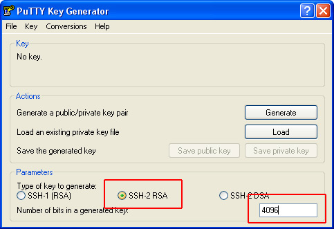
SSH Key Settings for Joyent Server:
Key Type: SSH-2 RSA
Number of Bits: 4096
Configure PuTTY to Connect to Joyent (Windows)
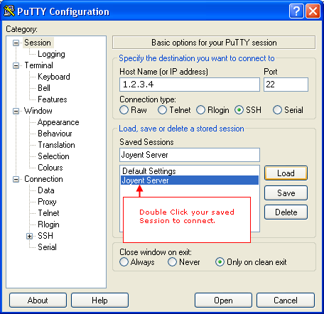
Configuring Putty to connect to Joyent Server is simple.
1. IP Address. Enter your Joyent Public IP Address in the Host Name text field.
2. Port. Set port to 22
3. Connection Type. Select SSH as Connection Type.
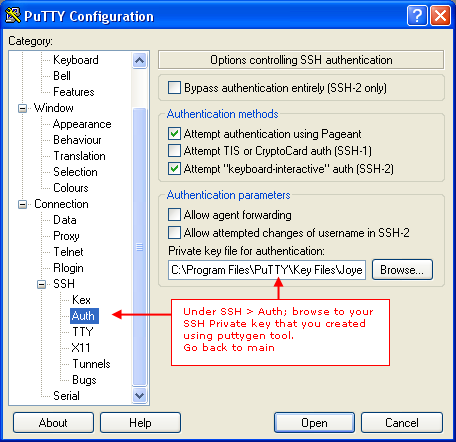
4. Private Key File.In “Category” TreeView component, open SSH node, select Auth Node. Under authentication parameters, browse to your private key file that you created using the puttygen tool. This file will have a .ppk file extension. [See image 2].
5. Save. Go back to main screen by selecting Session Node in the tree view and click Save to save your connection details.
Connect to Joyent using PuTTY
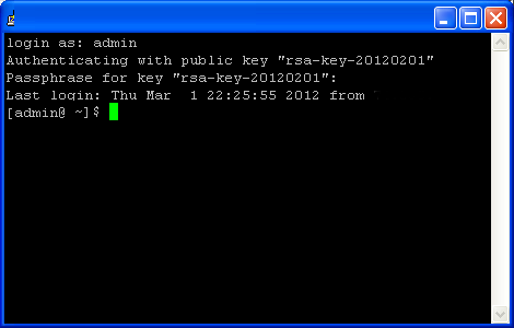
Finally, double click your Session to connect. You will enter the terminal session as shown in second photo below. On Windows, you will enter your username; such as root, admin, or any other users. Next enter passphrase for that user.

